Redecorating your living room can feel like a daunting task, especially when trying to find the right mood-enhancing colors. Our living spaces are where we unwind, entertain, and create lasting memories, so choosing the right colors is essential. That’s why I put together this guide on 14 Living Room Color Ideas That Change the Mood. Whether you’re dreaming of a serene oasis or a vibrant gathering spot, these eco-friendly color ideas will help you transform your space.
If you’re someone who loves home decor and interior design tips, this post is for you. You may be searching for ways to enhance the atmosphere of your living room or perhaps you’re just looking to refresh your space without a complete overhaul. You’ll find a range of options here that cater to different tastes and styles. Each color idea not only brings beauty but also a unique vibe to your living room, influenced by color psychology.
In this article, you’ll get practical insights into how each color can affect your mood and the overall energy of your home. From calming greens to bold reds, I’ll share the benefits of each color along with tips on how to incorporate them into your existing decor. By the end, you’ll be equipped with ideas that are not just visually appealing but also create a cozy environment for you and your loved ones.
Key Takeaways
– Explore 14 diverse color ideas for your living room that cater to different moods and styles, allowing you to find the perfect fit for your space.
– Learn about color psychology and how specific shades can influence your emotions, helping you create the ideal atmosphere in your home.
– Get practical interior design tips on how to incorporate these colors into your existing decor without a complete redesign.
– Discover eco-friendly color options that are sustainable and safe, ensuring your living space is both beautiful and healthy.
– Find inspiration for cozy living room ideas that will make your home a welcoming retreat for you and your guests.
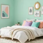
1. Serene Sage Green

Sage green is a tranquil hue that perfectly captures the essence of nature. This color fosters a peaceful atmosphere, ideal for relaxation after a busy day. It works beautifully with wooden furniture and textured fabrics, creating an eco-conscious aesthetic.
To enhance this calming vibe, introduce soft whites or creams in your decor, allowing the sage to shine without feeling overwhelming. A sage green accent wall can beautifully complement vibrant indoor plants, adding a refreshing touch to your living space.
Tips for incorporating sage green:
– Pair it with natural woods for a rustic charm.
– Use soft furnishings in similar shades for a cohesive look.
– Add metallic accents for a hint of sophistication.
This palette brings a soothing elegance to your home, where natural textures and materials enhance the overall beauty.
Serene Sage Green
Editor’s Choice


Key Trade-offs & Our Top Pick
Option Comparison
1. Serene Sage Green
– Pros:
– Creates a calming atmosphere that promotes relaxation.
– Pairs well with natural elements like wood and plants.
– Cons:
– Might appear too muted in poorly lit spaces.
– Can sometimes clash with brighter decor.
– Best for: Achieving a peaceful and nature-inspired living room atmosphere.
2. Bold Terracotta
– Pros:
– Adds warmth and a sense of grounding to the room.
– Works well as an accent color against neutral shades.
– Cons:
– Can be too intense in smaller rooms.
– May require careful pairing to avoid overwhelming the space.
– Best for: Creating a cozy, inviting setting, especially in larger living rooms.
3. Refreshing Ocean Blue
– Pros:
– Instantly brightens a room and adds a refreshing feel.
– Evokes feelings of tranquility and calmness.
– Cons:
– Can be difficult to balance with darker furniture.
– Might come off as too cool in colder climates.
– Best for: Spaces that need a breezy, beachy vibe.
4. Cozy Cream and Beige
– Pros:
– Offers versatility and a timeless elegance.
– Allows for easy mixing with various colors and styles.
– Cons:
– Can appear bland or washed out without vibrant accents.
– May show dirt more readily, requiring frequent cleaning.
– Best for: Homes aimed at an airy and spacious feel.
5. Energizing Mustard Yellow
– Pros:
– Infuses energy and cheerfulness into the living room.
– Pairs beautifully with dark woods and greys.
– Cons:
– Can be overpowering if used excessively.
– May not suit all tastes and decor styles.
– Best for: Families or individuals looking to boost mood and creativity.
Expert Recommendation:
Best Overall: Serene Sage Green
Serene Sage Green is our top pick for most people because it strikes a perfect balance of calmness and liveliness. This color works well in various lighting and decor styles, making it versatile for long-term use. Its natural vibe complements eco-friendly design approaches, ensuring you create a cozy living room that enhances your mood without overwhelming the senses.
Why We Picked This:
While Serene Sage Green is an excellent all-round choice, some may prefer the energy of Mustard Yellow or the warmth of Bold Terracotta. If you have a smaller space or are looking for a more soothing atmosphere, you might gravitate towards Soft Blush Pink or Tranquil Lavender instead. Each color brings its own unique flair and effect, so consider what mood you want to set in your living room.
2. Bold Terracotta

Terracotta is a warm, inviting color that radiates comfort and creativity. This hue can invigorate your living room, creating a cozy gathering space for family and friends. It pairs wonderfully with deep blues and sandy neutrals for a balanced aesthetic.
To make a bold statement, consider terracotta walls or accents throughout the room. Textured fabrics like cozy blankets and wicker baskets can enhance the earthy vibe of terracotta.
To avoid overwhelming the space, introduce lighter colors in your furniture and decor.
– Use terracotta planters to bring a touch of nature indoors.
– Add neutral cushions to balance the boldness.
– Pair with artwork featuring complementary colors for visual interest.
This approach adds warmth while maintaining a lively atmosphere, allowing for a welcoming environment.
Bold Terracotta
Editor’s Choice


3. Refreshing Ocean Blue

Ocean blue evokes a refreshing ambiance reminiscent of seaside tranquility. This color promotes a sense of calm, making it an ideal choice for a peaceful living room retreat. Whether as a primary wall color or in decorative accents, ocean blue brings a serene vibe.
Combining this shade with sandy beiges and crisp whites creates a coastal feel, perfect for a relaxed atmosphere. For a warm touch, consider adding coral or sunset orange accents.
Ideas for incorporating ocean blue include:
– Use blue cushions and throws for added depth.
– Create an ocean blue feature wall paired with earth tones.
– Incorporate natural textures such as seagrass or driftwood.
This color choice encourages a tranquil space where light and texture come together harmoniously.
Refreshing Ocean Blue
Editor’s Choice


4. Cozy Cream and Beige

For those who cherish warmth and simplicity, a cream and beige palette is incredibly effective. These shades create an inviting atmosphere that feels calm and welcoming. They are particularly useful in smaller spaces, as they reflect light beautifully to create an airy feel.
Adding wooden accents and earthy textiles enhances the warmth of this neutral scheme. To prevent monotony, mix various textures and layers, such as a chunky knit throw or a soft area rug.
Effective ways to utilize cream and beige:
– Add plants to introduce life into the neutral palette.
– Include art pieces with vibrant colors for contrast.
– Use layered lighting to foster a cozy atmosphere.
This combination offers a soothing backdrop, where varied textures amplify the inviting design.
❝ Fun fact: cream and beige palettes with low-VOC paints can boost perceived light in a living room by up to 20%, making color ideas for living room feel brighter. Pair with sustainable wood accents and natural textiles to add warmth without waste.
Cozy Cream and Beige
Editor’s Choice


5. Energizing Mustard Yellow

Mustard yellow is an excellent choice for those desiring a lively living room. This vibrant color energizes the space, making it ideal for anyone who enjoys a cheerful atmosphere. Mustard can work as an accent on walls or through decorative items like cushions and art pieces.
Pairing mustard with navy blue or deep green creates a bold yet harmonious look. Incorporating natural materials like wood and stone helps ground the bright hue to avoid overwhelming the space.
Tips for effectively using mustard yellow:
– Consider an accent wall to create a focal point.
– Introduce it in small doses through accessories.
– Combine with neutral colors for balance.
This approach ensures a vibrant yet inviting living space that radiates energy and warmth.
6. Tranquil Lavender

Lavender offers a soothing color option that encourages relaxation and peace. This gentle hue fosters a serene environment, perfect for unwinding or enjoying a good book. A lavender living room can feel chic and sultry when paired with white, grey, or soft green furnishings.
Introduce lavender through wall paint, curtains, or upholstery for a unified look. Incorporating darker shades of purple or lilac in patterns on cushions or artwork can add depth and richness.
Incorporate lavender like this:
– Choose lighter shades for walls and darker for accents.
– Add soft textures through plush rugs and thick curtains.
– Use metallic accents to bring in a touch of luxury.
This color choice creates a calming oasis where textures and layers enhance the overall aesthetic.
7. Earthy Rust

Earthy rust tones infuse your living room with warmth and rustic charm. This color feels grounding and comforting, helping to create a nurturing environment. Rust pairs beautifully with greens and browns, fostering a harmonious connection to nature.
Use rust as an accent through throws, cushions, or painted furniture pieces to create visual interest. Pairing rust with lighter shades can help balance its richness, ensuring your space remains cozy and inviting.
Ideas for incorporating earthy rust:
– Use as a statement chair or ottoman for a striking focal point.
– Add natural wood finishes to enhance the rustic theme.
– Incorporate woven textiles to add warmth.
This approach allows for a comforting yet stylish living space where natural tones resonate beautifully.
8. Refreshing Mint Green

Mint green is a lively and refreshing color that introduces a playful element to your living room. This cheerful hue inspires creativity and positivity, making it a fantastic backdrop for gatherings. Mint green harmonizes with various colors, from soft pastels to bold accents.
Consider mint walls or larger furniture pieces like sofas for a striking statement. Pairing mint with white or light wood can create a bright and airy atmosphere, while deeper tones lend depth.
To effectively use mint green:
– Combine with pastel colors for a soft and inviting look.
– Use colorful accessories like cushions and art for pops of fun.
– Incorporate plants to enhance mint’s fresh feel.
This joyful color choice fosters a vibrant and energetic environment in your living space.
Mint green is a refreshing, eco-friendly color idea for the living room—one of the best color ideas for living room. Pair it with white or light wood for brightness, or deepen it with charcoal for a grounding backdrop.
9. Chic Charcoal Grey

Charcoal grey is a sophisticated color that elevates your living room’s style. This deep hue provides a modern backdrop that pairs seamlessly with a variety of colors. Adding layers of texture with lighter furnishings and decor creates a chic, balanced look.
To introduce charcoal grey, consider using it for an accent wall or in larger furniture pieces. It beautifully complements jewel tones like emerald green or sapphire blue, creating stunning contrasts.
Suggestions for using charcoal grey:
– Add bright accents like yellow or pink for a striking contrast.
– Mix materials like velvet and leather for added depth.
– Incorporate metallics to achieve a glamorous touch.
This color choice brings sophistication, where the interplay of textures enhances the overall design.
Chic charcoal grey feels like a quiet hero in color ideas for living room—it’s a subtle canvas that elevates textures and eco-friendly fabrics shine. A charcoal backdrop makes emerald or sapphire accents sing without shouting, so you can refresh your space sustainably and stylishly.
Chic Charcoal Grey
Editor’s Choice


10. Vibrant Coral

Coral is a lively, invigorating color that brightens any living space. This upbeat hue can uplift your mood while ensuring a warm and welcoming vibe. Coral pairs beautifully with white, teal, or gold, creating a chic and balanced aesthetic.
Utilize coral in smaller furniture pieces, decor items, or as an accent wall to make a statement. When combined with earthy tones, coral brings a refreshing yet grounded feel.
Tips for utilizing coral:
– Incorporate through colorful textiles and wall art for vibrancy.
– Use as a statement chair or rug for an eye-catching focal point.
– Pair with natural materials for an organic look.
This vibrant choice adds a lively spirit to your living room, encouraging a cheerful atmosphere.
11. Soft Blush Pink

Blush pink is a delicate, romantic color that instills calmness and serenity. This gentle hue makes your living room feel cozy and inviting, perfect for both relaxation and socializing. Blush pink works beautifully with whites and greys, creating an airy and light ambiance.
Use blush pink in upholstery or as an accent through cushions and throws for a soft touch. It pairs especially well with metallic accents, delivering a chic and stylish vibe.
Ways to incorporate blush pink:
– Paint a feature wall in blush for a subtle pop.
– Add soft textiles to enhance comfort.
– Combine with greenery for a fresh touch.
This hue fosters a warm and inviting atmosphere, where plush textures elevate the overall design.
12. Classic Navy Blue

Navy blue is a timeless color that adds depth and richness to your living room. This elegant hue is incredibly versatile, creating both relaxed and sophisticated vibes. Navy beautifully pairs with light colors like white and cream, making it an excellent backdrop for showcasing vibrant artwork.
Use navy blue for larger pieces, such as sofas or feature walls, to craft a stunning focal point. Adding accents in gold or brass introduces a touch of elegance and warmth.
Ideas for incorporating navy blue:
– Use bold artwork to contrast against the dark hue.
– Incorporate textures to create layers and interest.
– Mix with warm tones for a cozy feel.
This color choice enhances your space with a sophisticated air, where rich tones create an inviting ambiance.
13. Energetic Red

Red is a dynamic color that can spark energy and passion in your living room. This bold choice makes a strong statement and draws attention, perfect for those who appreciate vibrant spaces. Use red as an accent rather than a main color to avoid overstimulation.
Pair red with neutral tones to balance its intensity, and consider adding metallic accents for a touch of glamour. Red harmonizes beautifully with earthy colors, merging warmth and vibrancy seamlessly.
Tips for using red effectively:
– Incorporate through artwork or decorative pieces for a splash of color.
– Choose a red accent wall for a bold statement.
– Use softer shades of red to maintain warmth without overwhelming the space.
This approach fosters a lively environment, where the balance of colors creates a dynamic and exciting atmosphere.
14. Soft Earth Tones

Soft earth tones are designed to create a grounded and harmonious living room atmosphere. These colors evoke a sense of calm and connection with nature, making your space feel warm and inviting. Shades like taupe, ochre, and soft browns blend beautifully for a layered look.
Utilize these colors in wall paints, furniture, and textiles to achieve a cohesive design. Pairing soft earth tones with greenery enhances the natural vibe, making your room feel refreshingly alive.
Best practices for styling with earth tones:
– Mix and match different shades for added depth.
– Add natural materials like wool and stone for texture.
– Incorporate plants to highlight the earthy feel.
This palette fosters a serene environment, where the interplay of colors and textures creates a beautiful, inviting space.
Conclusion

Choosing the right colors for your living room can dramatically transform the space and your mood.
By incorporating these eco-friendly color ideas, you can create a sanctuary that reflects your style while promoting well-being. Don’t be afraid to experiment and find the hues that speak to you – after all, your living room should be a joyful reflection of yourself!
Note: We aim to provide accurate product links, but some may occasionally expire or become unavailable. If this happens, please search directly on Amazon for the product or a suitable alternative.
This post contains Amazon affiliate links, meaning we may earn a small commission if you purchase through our links, at no extra cost to you.
Frequently Asked Questions
What are the best eco-friendly color ideas for living room that can change the mood?
Great question about eco-friendly color ideas for living room that can change the mood. Start with low-VOC paints in earthy tones like sage green, warm clay, and soft greys to create a calming base. If you want more depth, introduce natural pigments or mineral-based finishes on an accent wall. Build your palette around color ideas for living room that pair with sustainable fabrics, bamboo furniture, and cork rugs for a cohesive, eco-friendly look. Add living plants to bring vibrant color and improve air quality. Test swatches in multiple lighting conditions to see how the mood shifts, then balance with energy-efficient LED lighting and warm lamps to enhance coziness.
How can I choose mood-enhancing colors for a cozy living room while using low-VOC paints and sustainable materials?
To pick mood-enhancing colors for a cozy living room while staying eco-friendly, start with a calm neutral base and use accent colors drawn from nature. Mood-enhancing colors include soft blues for serenity, earthy terracotta for warmth, and muted greens for balance. Choose paints with low-VOC or plant-based binders, and opt for sustainable textiles and furniture. Use color in textiles and accessories rather than painting every surface to keep the space flexible and budget-friendly. Create depth with one or two feature walls or color-blocked zones, and let natural daylight guide your palette. Finish with energy-efficient lighting to amplify the mood without harming the environment.
What interior design tips help create living room color schemes that are both environmentally friendly and calming?
Here are practical tips to craft living room color schemes that are eco-friendly and calming: start with a sustainable base (low-VOC paint, untreated wood), choose a hero color and 2–3 supporting tones, layer textures (linen, wool, jute), and bring color in via textiles and art instead of heavy wallpaper. Favor natural materials and recyclable decor. Use the light to your advantage; lighter walls reflect more light in small spaces. Test swatches on different walls and observe under morning sun and evening bulbs. Finally, consider repurposing or upcycling furniture to maintain an eco-friendly vibe.
How does color psychology apply to eco-friendly color ideas for living rooms to boost comfort and productivity?
Color psychology helps you pick hues that influence mood, energy, and focus in an eco-conscious way. For a relaxing living room, choose hues like soft blues and greens to foster calm, warm neutrals with a touch of amber for coziness, and restrained yellows to greet attention without overstimulation. Pair these colors with low-VOC paints, natural textiles, and sustainable materials to keep the space healthy. Always test color samples in your room across different times of day to see how lighting changes the effect, then use warm lighting and plenty of greenery to reinforce the mood-enhancing impact.
What practical steps can I take to implement eco-friendly color ideas for a small living room on a budget?
Begin with a clear plan: pick a color ideas for living room base in a neutral, eco-friendly paint. Use large swatches on poster boards to preview how colors look in your space. Add color with affordable, sustainable textiles and secondhand accessories instead of repainting every surface. Use plants and natural materials to introduce color and texture without high costs. Optimize lighting with energy-efficient LEDs to maximize color impact. Finally, opt for upcycling or refitting existing furniture to keep the look cohesive and budget-friendly while staying true to an eco-friendly ethos.